A bold pitch.
In black and gold.
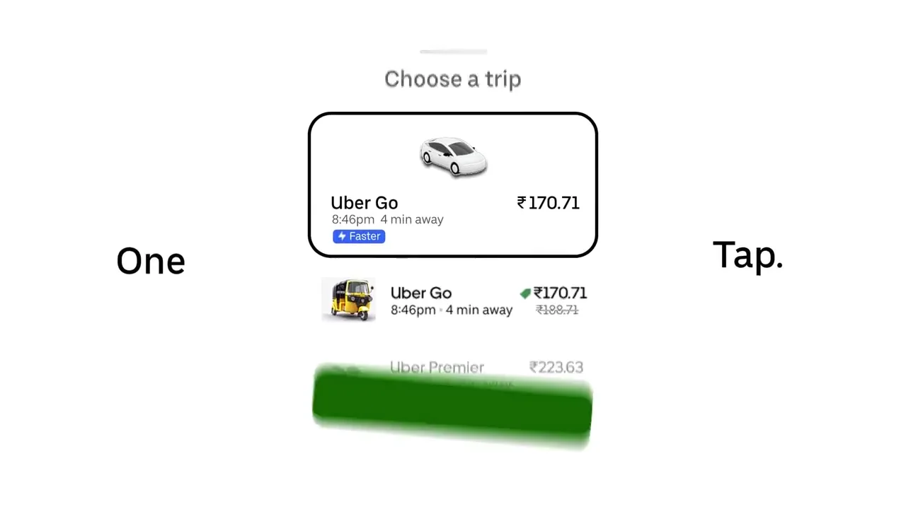
Interfaces, client stories and kinetic type.
A fast, confident promo for a digital marketing studio.
Turning a list of services into one punchy, rhythmic pitch.
Thoughtful motion.
Films you feel.
A little obsession in every frame.
I started at 14. On a broken laptop. With an idea I couldn’t leave alone.
A few considered films.
Each with something different to say.
Interfaces, client stories and kinetic type.
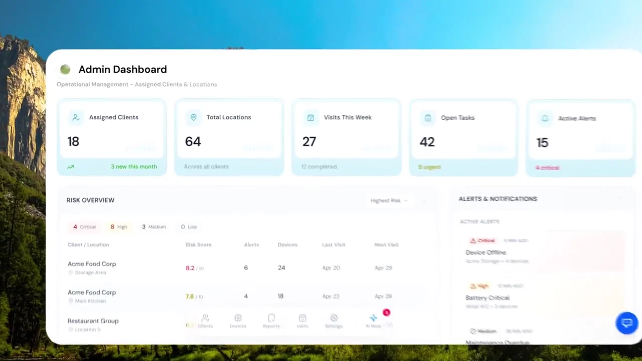
A fast, confident promo for a digital marketing studio.
Turning a list of services into one punchy, rhythmic pitch.
A product introduction built around interface,
typography and the rhythm between them.
Documents. Decisions. People.
A connected story for a more considered boardroom.
Making a suite of features feel like one coherent experience.
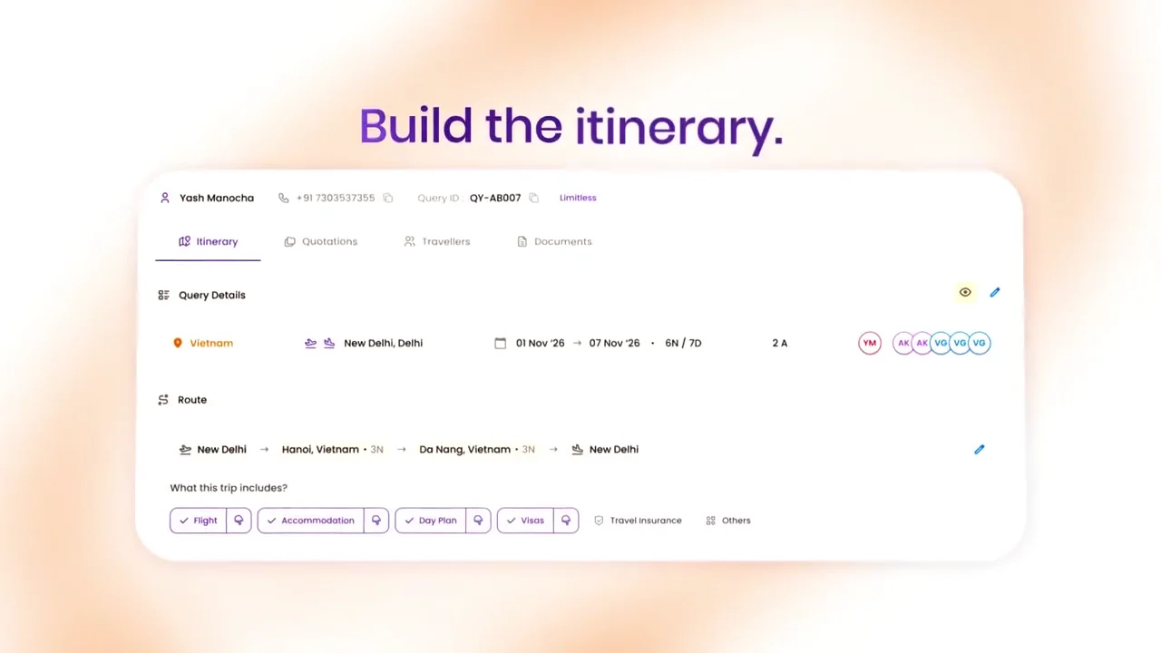
A travel platform, told through
type, interfaces and movement.
A visual story about the work
behind every journey.
Motion. With something to say.
A little obsession in every frame.
Made to move. Built to stay.
01 / 03An independent study in interface rhythm, transitions and the small details that make a product feel alive.
An independent exploration of familiar interfaces, visual storytelling and motion.
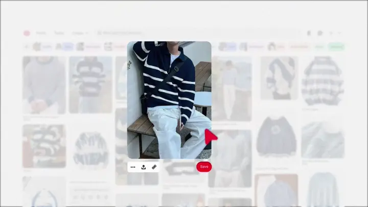
A motion study of discovery: searching, collecting and exploring a visual feed through clean interface animation.
Three personal edits.
Little pieces of my world.
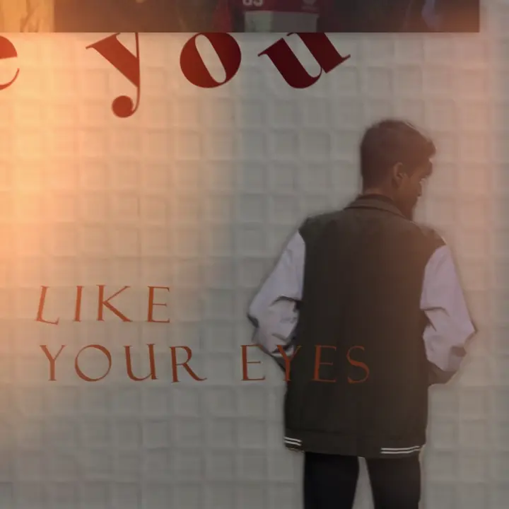
Everyday moments, cut-out portraits and handwritten type, brought together in a playful collage.
Clips are cut out and pinned onto bare paper, words are scrawled across the frame, and bursts of glitch tear through the colour, like flipping back through a camera roll and keeping only the moments that felt like something.
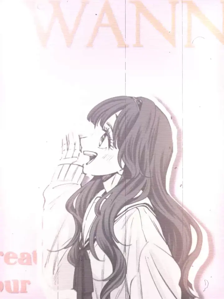
A personal manga edit in blush tones, with layered characters and expressive typography.
Manga panels and drawn characters drift in and out of soft pink washes and open white space, and the lyrics float through the frame at an unhurried, tender pace. Less a cut, more a feeling held for a little longer.
Warm paper textures, personal footage and lyric-led compositions in a scrapbook-inspired edit.
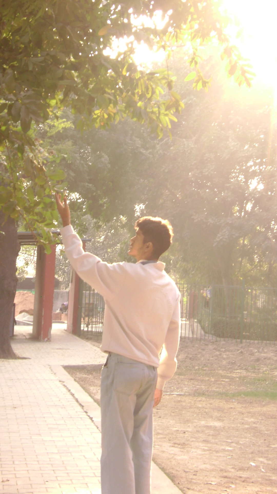
Grid paper, festival crowds and golden-hour footage are layered like pages in a scrapbook. The title arrives in tumbling 3D letters, and the closing lyric breaks through a shattered frame.
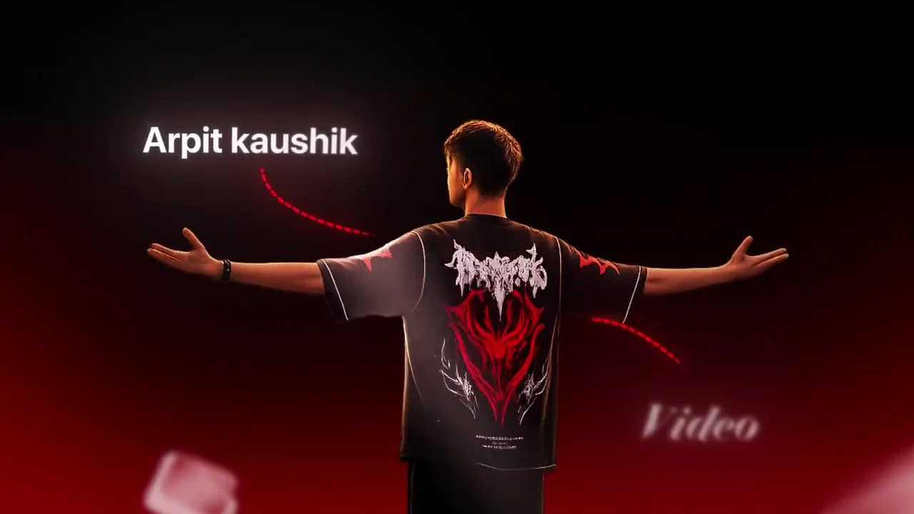
OFF THE TIMELINE. STILL THINKING ABOUT IT.I’m Arpit, a self-taught motion designer and video editor from Delhi. I make product films, brand motion and personal edits—with the same attention to the details you might only feel.
MORE OF MY WORLD ↗Move the divider to explore the comparison.
The same ad, straight from the camera and after the edit.
Make your product easier to understand and harder to forget. Interface animation, SaaS explainers and brand films with a considered visual rhythm.
PRODUCT FILMS / SAAS / BRAND MOTIONTELL ME THE IDEA ↗A visual language that moves with your brand. Launches, campaign pieces and social creatives that feel like they belong together.
CAMPAIGNS / LAUNCHES / SOCIAL ADSLET’S MAKE IT MOVE ↗Precise pacing, purposeful sound and visual details that give a short film something to say.
REELS / SHORTS / STORY-LED EDITSSTART A CONVERSATION ↗01 · BriefWe pin down the idea, the audience and what the film needs to say.
02 · Rough cutStructure first: story, pacing and the shape of the edit.
03 · FeedbackYour notes shape the next pass.
04 · FinalMotion, sound and finishing, exported for where it will live.
a.